Home › Forums › Products › Stompboxes › H9 Control: What’s with the iOS 6 design motif?
- This topic is empty.
-
AuthorPosts
-
-
December 1, 2019 at 1:08 pm #115642
Just got my 2 H9s today and hooked them up to the H9 Control app on my Mac and iPad.
Why the heck does this app have a circa 2012 iOS 6 interface? And why is the iOS interface on the Mac app? This ancient interface really makes these premium products seem cheap, and sends a signal that Eventide as a company can’t be bothered to occasionally update the app to modern standards for products which cost over $500 each. Come on. This is my first experience with your products and it feels like I’m in the iOS stone age. Can you at least put SOME love and care into this app? Is there a plan to update it anytime soon?
-
December 4, 2019 at 11:46 pm #153404
In respectful counterpoint-
I, for one, am glad I learned the interface once and don’t have to constantly re-learn it every dev cycle. Cubase does that too me too much already.
There are some enhancements that I would welcome.. but a ‘refresh’ for fashion? I would hate that. I’m busy playing music here.
-
December 4, 2019 at 11:54 pm #153405
I definitely understand that viewpoint as it is totally frustrating when companies change interfaces drastically between releases and nothing is where you expect it to be. Especially for things as critical as audio apps which need to be stable and rely on muscle memory. I’m not looking for the entire app to be re-designed in the way it functions, the workflow, location of buttons and knobs, etc. But a refresh to have the Settings page, pop-up warnings, and all the parts that are “iOS 6-ish” simply updated to look modern would be nice. Right now it just looks a bit weird and unprofessional on modern devices in my opinion. I haven’t seen a single other app nowadays (not to mention one that’s a companion to a $500+ product) that looks like it was created 6+ years ago and never visually updated to match everything else in iOS 7 and beyond. I mean come on we’re on iOS 13 now. It’s time to give the H9 Control a little TLC.
-
December 5, 2019 at 2:42 am #153407
Well, welcome to the Board!
Luckily for us all, the app design has no effect on the sonic awesomeness. -
December 6, 2019 at 11:30 pm #153440
Nothing wrong with the interface if you ask me. Most important thing is that it works and has a nice and easy workflow and doesn’t distract me from making music. To me that is much more important than a fancy 2020 interface with bells and whistles.
-
December 7, 2019 at 5:43 pm #153446
“iOS 6-ish”, “7”, “iOS 7 and beyond”
Are those… like… fashion periods?
-
December 10, 2019 at 3:35 pm #153459bengarland wrote:
Just got my 2 H9s today and hooked them up to the H9 Control app on my Mac and iPad.
Why the heck does this app have a circa 2012 iOS 6 interface? And why is the iOS interface on the Mac app? This ancient interface really makes these premium products seem cheap, and sends a signal that Eventide as a company can’t be bothered to occasionally update the app to modern standards for products which cost over $500 each. Come on. This is my first experience with your products and it feels like I’m in the iOS stone age. Can you at least put SOME love and care into this app? Is there a plan to update it anytime soon?
I couldn’t agree more. It is so outdated it already hurts. Look how modern the H9000 GUI looks. I think a design overhaul is heavily overdue. It really feels like a neglected product if not kept uptodate. So please eventide give it some love: )
-
December 11, 2019 at 3:38 am #153467
I agree.. the h9000 interface IS pretty hot:
-
December 14, 2019 at 2:30 am #153489
“Modern” GUI design is currently considered flat (no speculars or edge effects) design with simple geometry and muted colors first introduced with windows mobile.
Personally, it’s uninteresting and unmotivating but especially UNIMPORTANT. I like the current H9 graphics although some improvements in data entry are always appreciated. Please don’t change it – add FUNCTIONALITY over COSMETICS.
-
December 14, 2019 at 4:17 am #153490
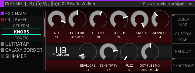
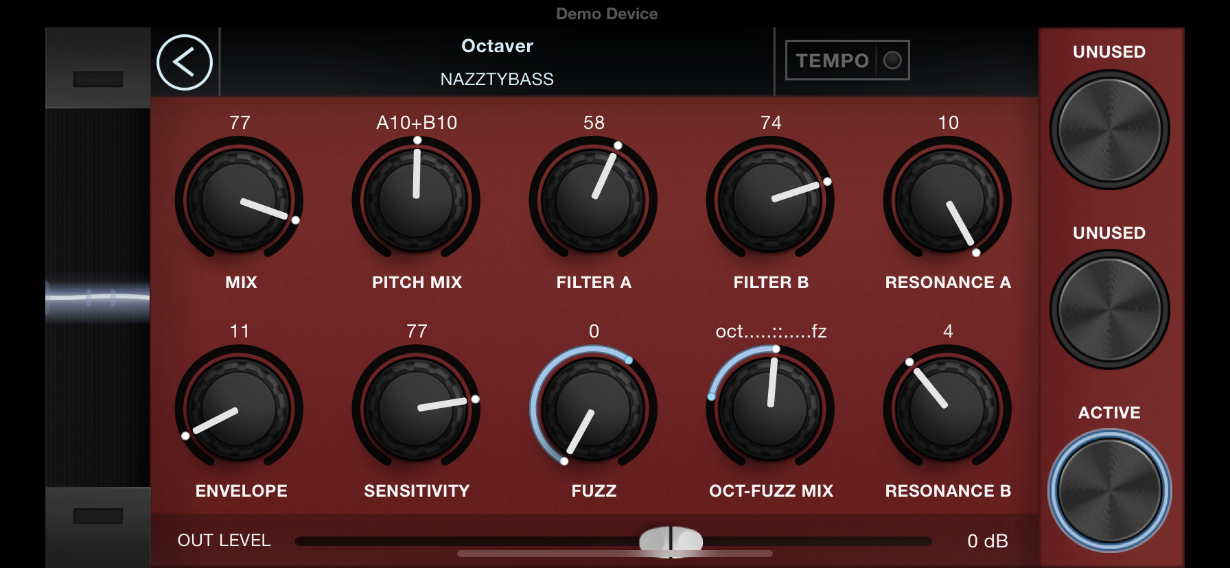
OK guys…I'll just post this screenshot I took on my phone. It's the same preset with same parameters and values. Just wondering which one looks more modern to you guys.
-
December 14, 2019 at 5:11 am #153492
Okay as the OP I’m chiming in again. I only have 2 main issues with the app:
1) The pop-up notifications and the Pedal Settings and Settings pages look like iOS 6 — just upgrade it to look like standard iOS 13 alerts and toggles instead (and fix the misaligned text on the toggles). Additionally there are just too many settings pages… too much clicking back and forth to change things, considering that there is a huge amount of unused screen space on the settings pages. Many of the settings under “Pedal Settings: General Settings” are simple Yes/No type of things, so why not just put most of those all on one page? e.g. make them a standard iOS On/Off slider toggle within the General Settings page itself, instead of having to actually click on e.g. “Bypass Enabled”.
2) The Algorithms page graphics are mostly unnecessary because they’re all the same, with the exception of some of the H9 algorithms having custom icons (e.g. SpaceTime and Harmadillo) — if you’re not gonna make a custom icon for every algorithm, then don’t do graphics for any of them. It’s a needless waste of space if the graphics aren’t going to differentiate anything.
I actually have no issue whatsoever with the graphics for the presets themselves…. the knobs and sliders look fine to me, and I prefer something that looks a bit realistic since I’m actually using this software to control a real hardware device. I just want to see the above issues fixed so the app looks a bit more polished and less like abandonware.
-
December 14, 2019 at 6:02 am #153493
I like the h9000, but the Expression pedal range would be less clear… So i vote keep it how it is.
-
December 14, 2019 at 4:04 pm #153497
If you do any graphics work add more Graph/Basic Views for Algorithms. Facelifts and Design updates are NOT why we bought this product.
-
December 14, 2019 at 5:08 pm #153501Nobody was talking about changing the graphics for each of the algos but more of the whole design around, which is based on the ios 6 framework, which is 7 or 8 years old, so just updating this would make for a proper update. Sorry, but all apps get those components updated regularly, so they go hand in hand with the operating system. It just feels not well that this is not updated in a premium product.Besides that, I started to use it on my Mac and have to say that I got so hooked by using everything via Bluetooth I’m thinking of selling my Orville and getting an H9000 with great graphics 😉
-
December 14, 2019 at 5:49 pm #153502
To the OP:
Good discussion here….I just can’t visualize the suggestions you are making, because I don’t use IOS. Do you think your suggestions are good for cross platform application? Or should there be a ‘special’ GUI just for IOS devices?
You did mention some objection to the same design on IOS and Mac… So i kind of think you are advocating for 4 different design strategies?Personally I would think the Eventide engineers are smart using a unified design. Easy to switch devices. Easier to maintain. I’d rather they worked on juicy sonic goodness than 4 different GUIs.
-
December 12, 2019 at 9:05 pm #153480camn wrote:
I agree.. the h9000 interface IS pretty hot:
I don’t get why that looks more modern than the H9 control interface.
-
December 14, 2019 at 7:05 am #153494skywriter wrote:“Modern” GUI design is currently considered flat (no speculars or edge effects) design with simple geometry and muted colors first introduced with windows mobile.
Personally, it’s uninteresting and unmotivating but especially UNIMPORTANT. I like the current H9 graphics although some improvements in data entry are always appreciated. Please don’t change it – add FUNCTIONALITY over COSMETICS.
Couldn’t agree more it’s totally unimportant and it doesn’t make you play better. More important is functionality and ease of use.
To me the H9 version looks better than the H9000 version. So keep it as it is and only add functionality if necessary. There are other more important things to worry about.
-
-
AuthorPosts
- You must be logged in to reply to this topic.
